Signal-led dashboard architecture
We structured the product around the information traders want surfaced first: price, status, confidence, and trend context.
A finance-facing dashboard concept that turns complex market signals into a cleaner decision environment.
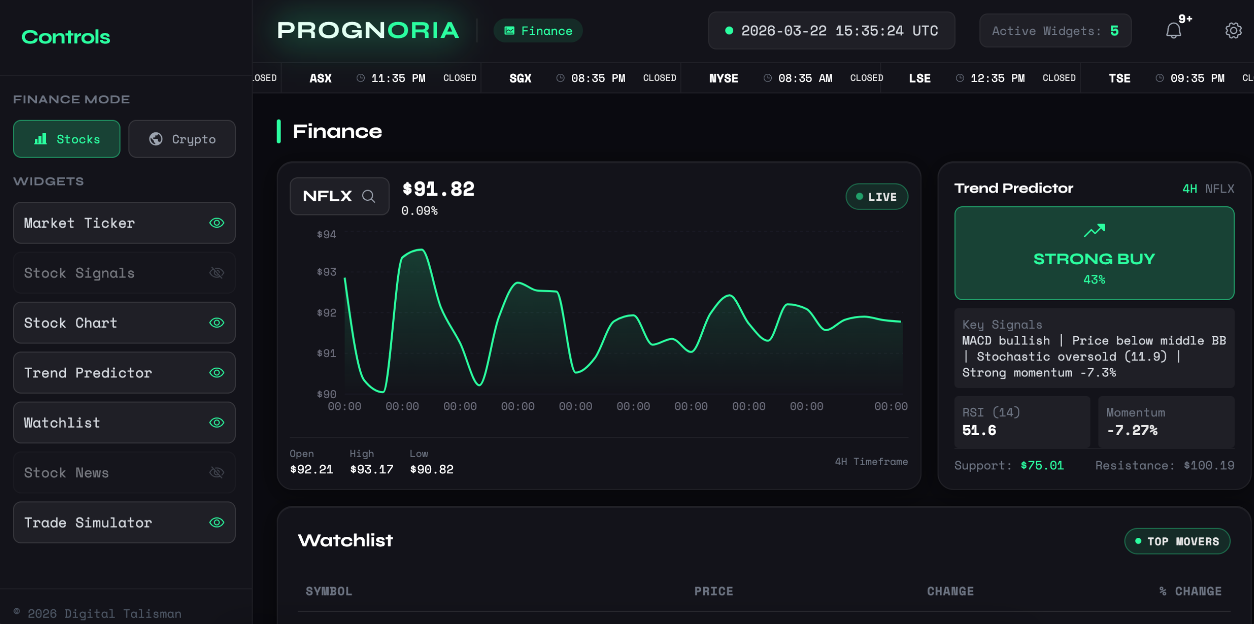
PROGNORIA needed to present dense market information without collapsing into dashboard chaos.
The audience expects speed, precision, and signal prioritization rather than decorative charts.
This mattered because finance tools lose trust fast when information feels cluttered or hard to act on.
The solution had to be practical, usable, and aligned with the real business pressure behind the project.
We structured the product around the information traders want surfaced first: price, status, confidence, and trend context.
The interface supports charting, watchlists, predictors, and market summaries without making any single panel feel accidental.
The visual language was tuned for dense information work, using contrast and spacing to reduce fatigue.
A stronger outcome comes from a stronger process, not from improvising the whole thing in code.
Defined the decision moments that matter most in active market monitoring.
Prioritized widget relationships and glanceability across the main dashboard.
Implemented a structured product shell designed for data-heavy SaaS workflows.
Reviewed panel hierarchy, readability, and dashboard rhythm under dense content.
Delivered a cleaner foundation for a finance-oriented analytics product.
Prepared the system for deeper forecasting, alerts, and user-specific views.
Where exact numbers were not available or public, the case study uses directional outcomes grounded in the product and business context.
The interface makes core signals easier to locate and compare.
Widgets now feel like part of one product logic.
The product now has a clearer base for future SaaS expansion.
Finance interfaces win when signal outranks spectacle.
Forecasting needed context from charts and supporting indicators, not isolated hype.
Phase one focused on the core analyst experience before permission complexity.
We design SaaS interfaces that make dense systems easier to use without flattening their power.
If this project feels close to what you need, these pages show how the same thinking applies to specific industries, locations, and operational problems.