Clear corporate positioning
We built a structure that made the firm's services legible at a glance instead of burying them in generic copy.
A sharper corporate website that made the business feel credible, easier to understand, and easier to contact across investment and logistics audiences.
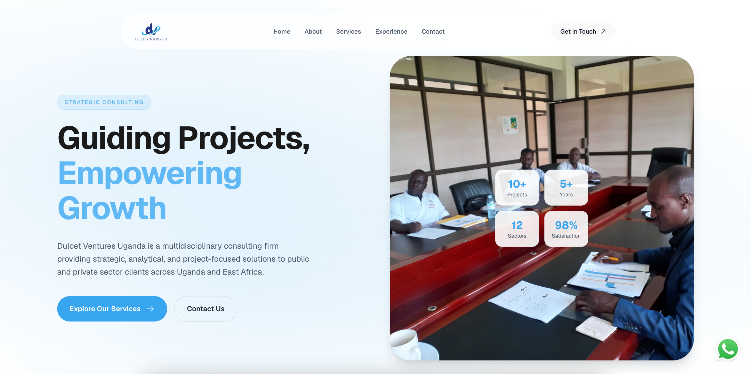
Dulcet needed a serious web presence that matched the weight of its business conversations.
The company serves both local and regional stakeholders, so the site had to feel credible to decision-makers beyond Uganda.
This project mattered because the brand had reached a stage where informal presentation was starting to undercut trust.
The solution had to be practical, usable, and aligned with the real business pressure behind the project.
We built a structure that made the firm's services legible at a glance instead of burying them in generic copy.
The visual system used restraint, hierarchy, and clean pacing so the site felt credible rather than ornamental.
We reduced friction around contact and made the next step obvious from every major section.
A stronger outcome comes from a stronger process, not from improvising the whole thing in code.
Mapped what prospects needed to understand in the first 60 seconds.
Restructured the site around business clarity, not page count.
Developed a polished marketing site with reusable sections and responsive behavior.
Reviewed readability, responsiveness, and decision-making flow across devices.
Published a cleaner, more credible digital front door for the business.
Left room for future growth in case studies, service depth, and content.
Where exact numbers were not available or public, the case study uses directional outcomes grounded in the product and business context.
Visitors can understand the business model much faster.
The site now better supports serious conversations with partners and clients.
The contact journey now feels like part of the sales process, not an afterthought.
We avoided flashy treatment because authority mattered more than novelty here.
The fastest win was making the offer intelligible before adding editorial overhead.
This phase focused on credibility and conversion, not custom admin infrastructure.
We can help turn an underselling digital presence into a serious business asset.
If this project feels close to what you need, these pages show how the same thinking applies to specific industries, locations, and operational problems.