Distinctive visual language
We used strong typography, contrast, and pacing to avoid the interchangeable agency look.
A brand site that acts like proof of work: distinctive enough to be memorable, structured enough to convert, and sharp enough to justify premium positioning.
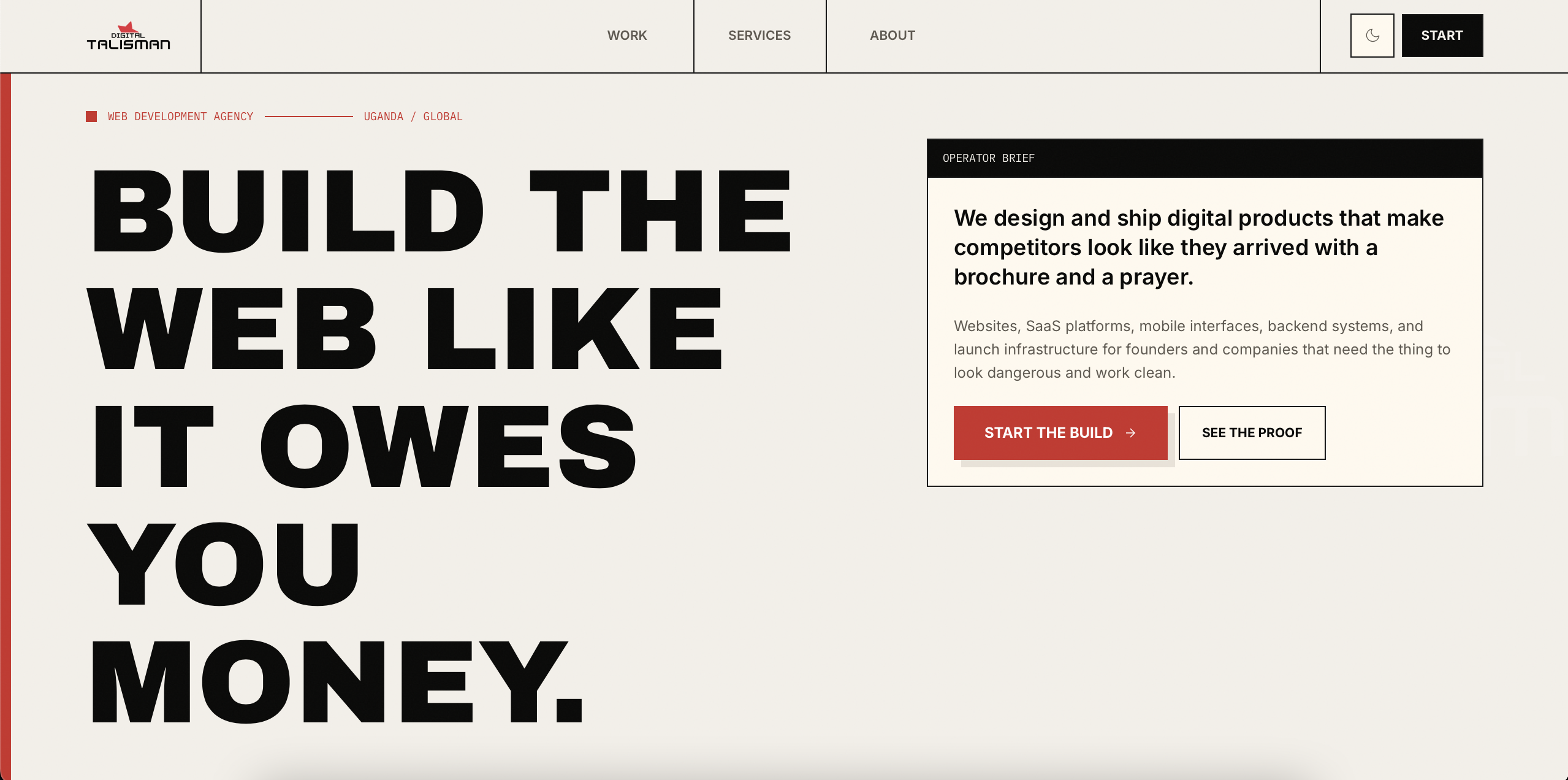
This site had to do more than describe Digital Talisman. It had to demonstrate how the studio thinks and builds.
The audience includes founders, operators, and teams comparing many agencies that look interchangeable online.
The project mattered because positioning is fragile: if the site feels generic, the studio feels generic.
The solution had to be practical, usable, and aligned with the real business pressure behind the project.
We used strong typography, contrast, and pacing to avoid the interchangeable agency look.
The site leans on real work, real process, and strong positioning rather than generic capability lists.
The portfolio flow is now being expanded so projects can sell outcomes and thinking, not just screenshots.
A stronger outcome comes from a stronger process, not from improvising the whole thing in code.
Clarified what the studio should feel like versus what most agencies currently feel like.
Built a site rhythm that moves from positioning to proof to action.
Implemented a modern Next.js experience with motion, SEO structure, and reusable systems.
Reviewed responsiveness, readability, and trust flow across key pages.
Published a stronger digital home for the studio.
Continues evolving through sharper proof, better portfolio depth, and stronger conversion paths.
Where exact numbers were not available or public, the case study uses directional outcomes grounded in the product and business context.
The site now has a stronger personality and point of view.
Work can now be framed around thinking and results instead of just outbound links.
The structure does more to show capability than merely state it.
The site needed to feel deliberate and memorable, not trend-compliant.
A smaller number of stronger sections beats a bloated, forgettable brochure.
The build supports future growth in case studies, services, and editorial proof.
We can help you shape the story, the system, and the build so the work carries its weight.
If this project feels close to what you need, these pages show how the same thinking applies to specific industries, locations, and operational problems.