Immersive app interface
We designed the experience to feel like part nightlife companion, part utility, with strong visual energy and clear structure.
A mobile-first dining experience that turns nightlife discovery, reservations, and menu browsing into one coherent flow.
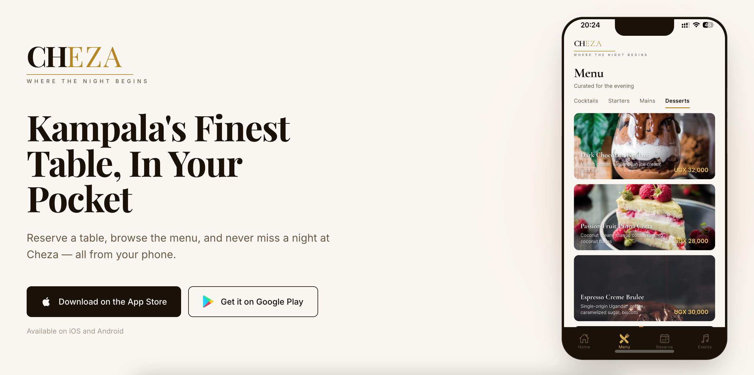
Cheza sits in a nightlife and dining category where attention is short and user taste is high.
The product needed to feel exciting enough for customers but organized enough for operational use.
This project mattered because fragmented dining experiences often lose users before they commit to a reservation or order.
The solution had to be practical, usable, and aligned with the real business pressure behind the project.
We designed the experience to feel like part nightlife companion, part utility, with strong visual energy and clear structure.
The product brings browsing, menu inspection, and reservation intent together instead of sending the user elsewhere.
Animations and screen composition were tuned to feel fluid on phones, not like a web layout stuffed into an app shell.
A stronger outcome comes from a stronger process, not from improvising the whole thing in code.
Mapped the emotional journey from interest to table booking.
Designed around decision speed, category browsing, and mobile behavior.
Implemented the product in React Native with an interface optimized for motion and clarity.
Validated readability, touch targets, and navigation rhythm across screens.
Packaged the experience as a stronger hospitality product story.
Prepared feature pathways for events, offers, and deeper retention loops.
Where exact numbers were not available or public, the case study uses directional outcomes grounded in the product and business context.
Discovery, menus, and action now live in one place.
The product now feels differentiated in a crowded attention environment.
Reservations and menu exploration happen with fewer steps and less uncertainty.
In nightlife, desire and atmosphere are part of conversion, not decoration.
Menus are one of the strongest commitment triggers, so they deserved first-class treatment.
We focused on the customer-facing journey before expanding operator tooling.
We build mobile products that make users want to keep moving forward, not bounce after the first screen.
If this project feels close to what you need, these pages show how the same thinking applies to specific industries, locations, and operational problems.